fix(autocomplete): autocomplete panel theme supports dark mode#11203
Conversation
 googlebot
added
the
cla: yes
googlebot
added
the
cla: yes
 rudzikdawid
force-pushed
the
fixAutocompletePopupTheme
branch
from
rudzikdawid
force-pushed
the
fixAutocompletePopupTheme
branch
from
b3296b8 to
a1bee77
Compare
rudzikdawid
changed the title
 Splaktar
added
type: bug
ui: theme
in progress
Splaktar
added
type: bug
ui: theme
in progress
|
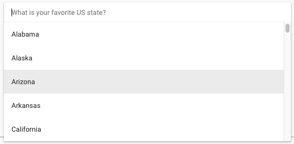
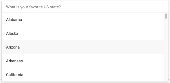
The focus background color in light mode has gotten significantly lighter. It should stay the same or at minimum be visually indistinguishable. Before: Before: |
 Splaktar
left a comment
Splaktar
left a comment
Splaktar
left a comment
There was a problem hiding this comment.
Please ensure that the light mode colors don't change.
rudzikdawid
force-pushed
the
fixAutocompletePopupTheme
branch
from
a1bee77 to
5d43eef
Compare
|
You have right so i tried your solution from #11198 after that i tried with hover before: after: dark mode: you can check it again, i made |

 rudzikdawid
force-pushed
the
fixAutocompletePopupTheme
branch
from
rudzikdawid
force-pushed
the
fixAutocompletePopupTheme
branch
from
5d43eef to
dd28d4a
Compare
|
Thanks for the update. I went with |
|
I think that master build https://material.angularjs.org/latest/demo/autocomplete: hover changes with i use converter rgba to rgb result of convert: master build: results of difference between at this moment the differences are really small, cosmetic :) |

|
Yep, as mentioned in #11198 (comment), let's use |
 rudzikdawid
force-pushed
the
fixAutocompletePopupTheme
branch
from
rudzikdawid
force-pushed
the
fixAutocompletePopupTheme
branch
from
dd28d4a to
1d80633
Compare
|
done |
Splaktar
added
the
needs: manual testing
|
According to https://material.io/guidelines/components/text-fields.html#text-fields-states, it appears that a disabled dark mode text field ( According to https://material.io/guidelines/components/text-fields.html#text-fields-text-field-boxes (I think that this maps closest to our autocomplete design w/o |
|
I don't see any combination that we have available atm that meets the requirements listed in my last post. I think that we should go with the following for the time being: &[disabled]:not([md-floating-label]) {
background: '{{background-default}}';
}It still provides a difference between enabled/disabled styling, but avoids applying a darker background color than the default background. |
|
But then again, testing light mode |
|
i see this issue also on master build. So maybe we should open another issue/PR for that. |
Splaktar
removed
the
needs: manual testing
|
I think that we can send this for presubmit testing now. |
Splaktar
added
pr: merge ready
5 participants
PR Checklist
Please check that your PR fulfills the following requirements:
PR Type
What kind of change does this PR introduce?
What is the current behavior?
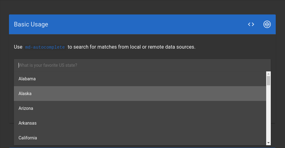
The autocomplete panel is always using light mode hues even when the theme is dark mode.
Issue Number:
#11202
What is the new behavior?
The autocomplete panel use dark mode hues when the theme is set to dark mode.
Does this PR introduce a breaking change?
Other information
Before:
After: