Skip to content

Add Qt GUI refresh w/branding updates#3000

Merged
UdjinM6 merged 19 commits into
dashpay:developfrom
nmarley:qt-gui-refresh
Oct 31, 2019
Merged

Add Qt GUI refresh w/branding updates#3000
UdjinM6 merged 19 commits into
dashpay:developfrom
nmarley:qt-gui-refresh

Conversation

@nmarley

@nmarley nmarley commented Jun 24, 2019

Copy link
Copy Markdown

Align Qt wallet better with new style guidelines and consistent branding

Removes old non-default themes due to brittle design (they don't play well with new redesign)

Remove small 3 buttons underneath PS button

  • The try and reset buttons are not necessary
  • The PS info modal is still available via the help menu

This is an alternative to #2204

Please see individual commits for more granular info on changes.

@UdjinM6

UdjinM6 commented Jun 24, 2019

Copy link
Copy Markdown

+68 −7,547 - nice :)

@UdjinM6

UdjinM6 commented Jun 24, 2019

Copy link
Copy Markdown

Few notes:

  • should run contrib/devtools/optimize-pngs.py to shrink new images a bit (Total reduction: 98903 bytes);
  • should drop images/light/about.png because it's no longer used after f924607;
  • would prefer the old "remove.png" icon (the one used in Console tab, the new one looks weird there imo).

All these changes in one commit UdjinM6@ad784aa

Could also adjust masternodes.png icon to match new style while at it I guess.

@nmarley

nmarley commented Jun 24, 2019

Copy link
Copy Markdown
Author

Added your commit, thanks @UdjinM6 . I've reached out to Suba to help w/the MN icon, and he said he found some more that he missed, so will wait for a patch from him (should be pretty quick).

@PastaPastaPasta PastaPastaPasta left a comment

Copy link
Copy Markdown
Member

Choose a reason for hiding this comment

The reason will be displayed to describe this comment to others. Learn more.

The S at the end of the titles are cut off when selected

Again

again

I'm not sure I'm a fan of the header font on the overview page

not fan of font
The logo isn't centered. Imo it should be

logo close to bottom

Page names also arent centered, imo should be

also not centered

@PastaPastaPasta

PastaPastaPasta commented Jun 25, 2019

Copy link
Copy Markdown
Member

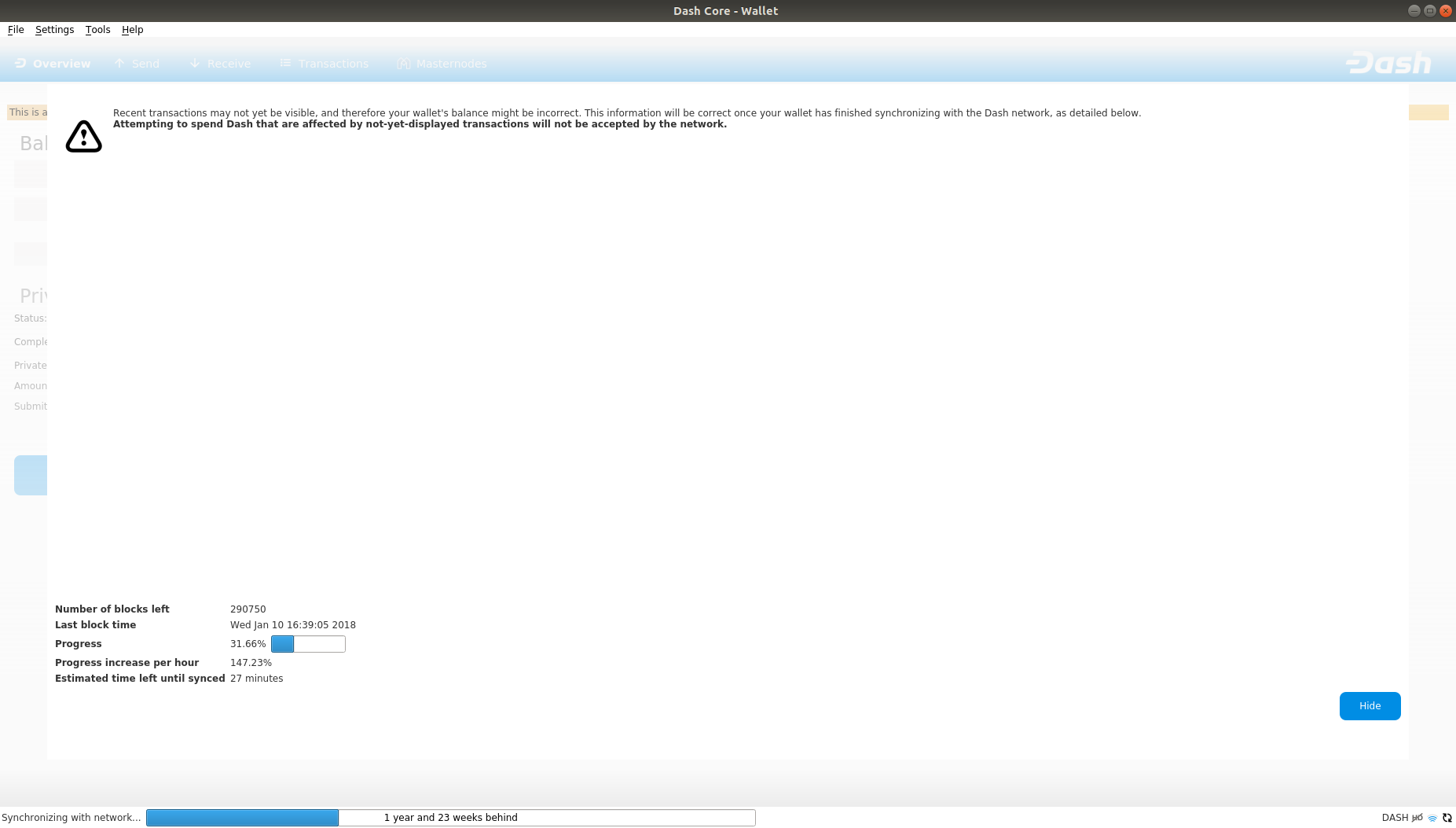
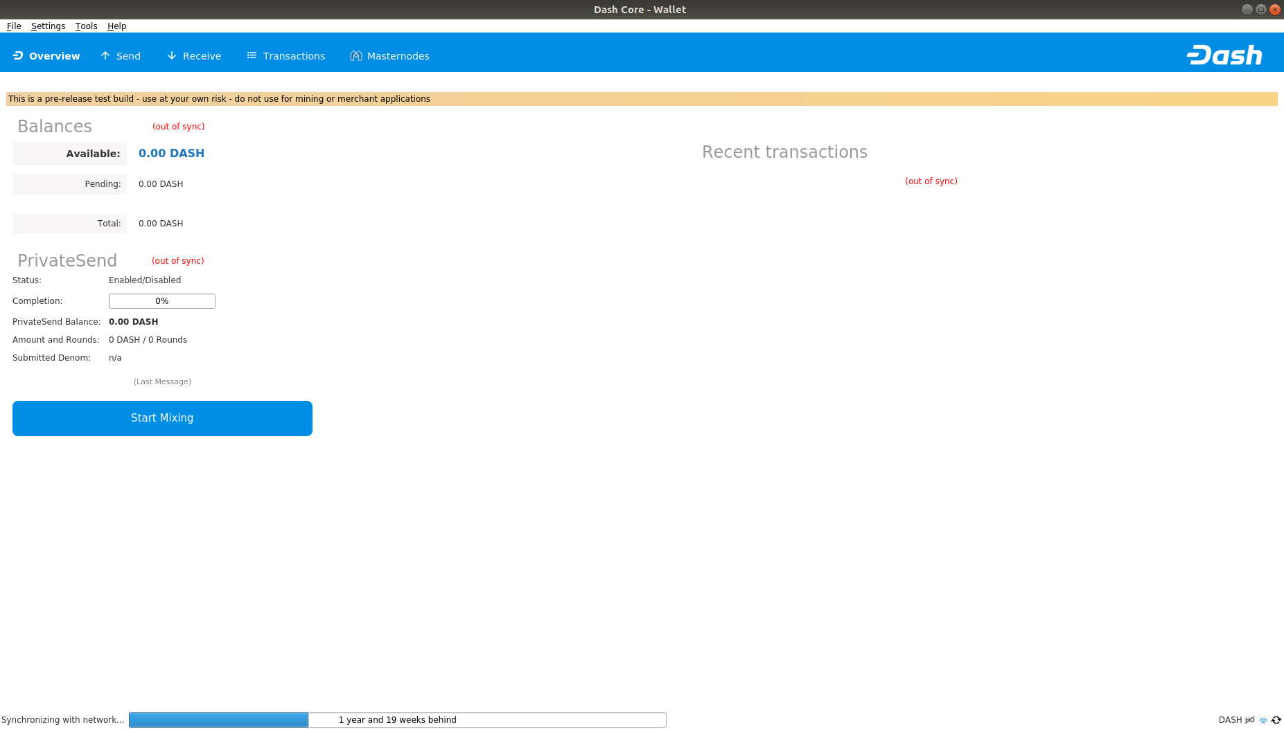
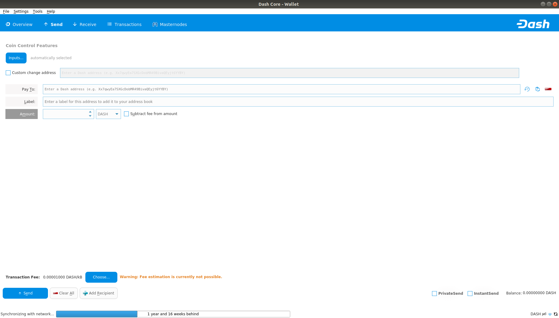
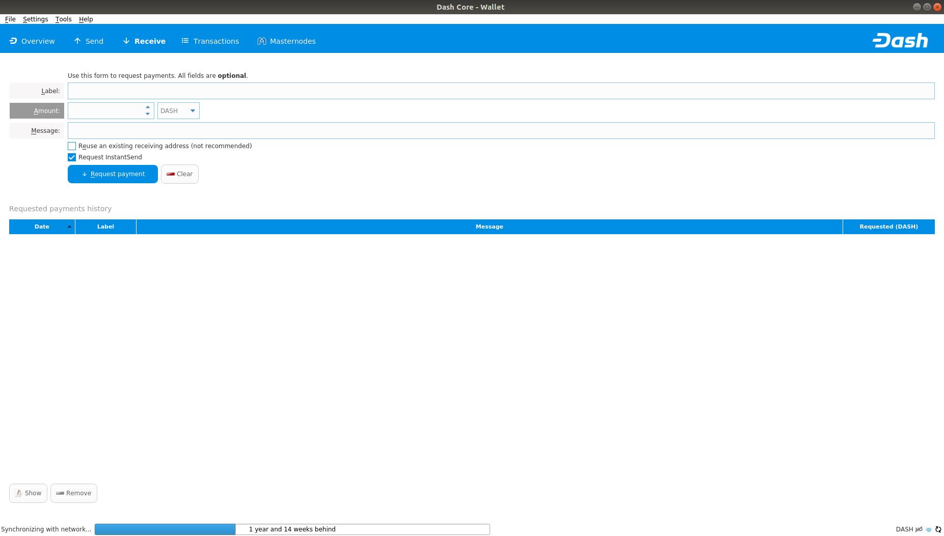
General overview below as of 33d0fee (compiled on ubuntu so might look a little different to windows builds)

sync page
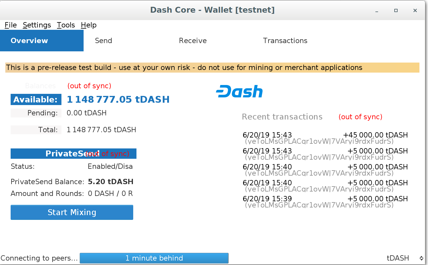
Overview
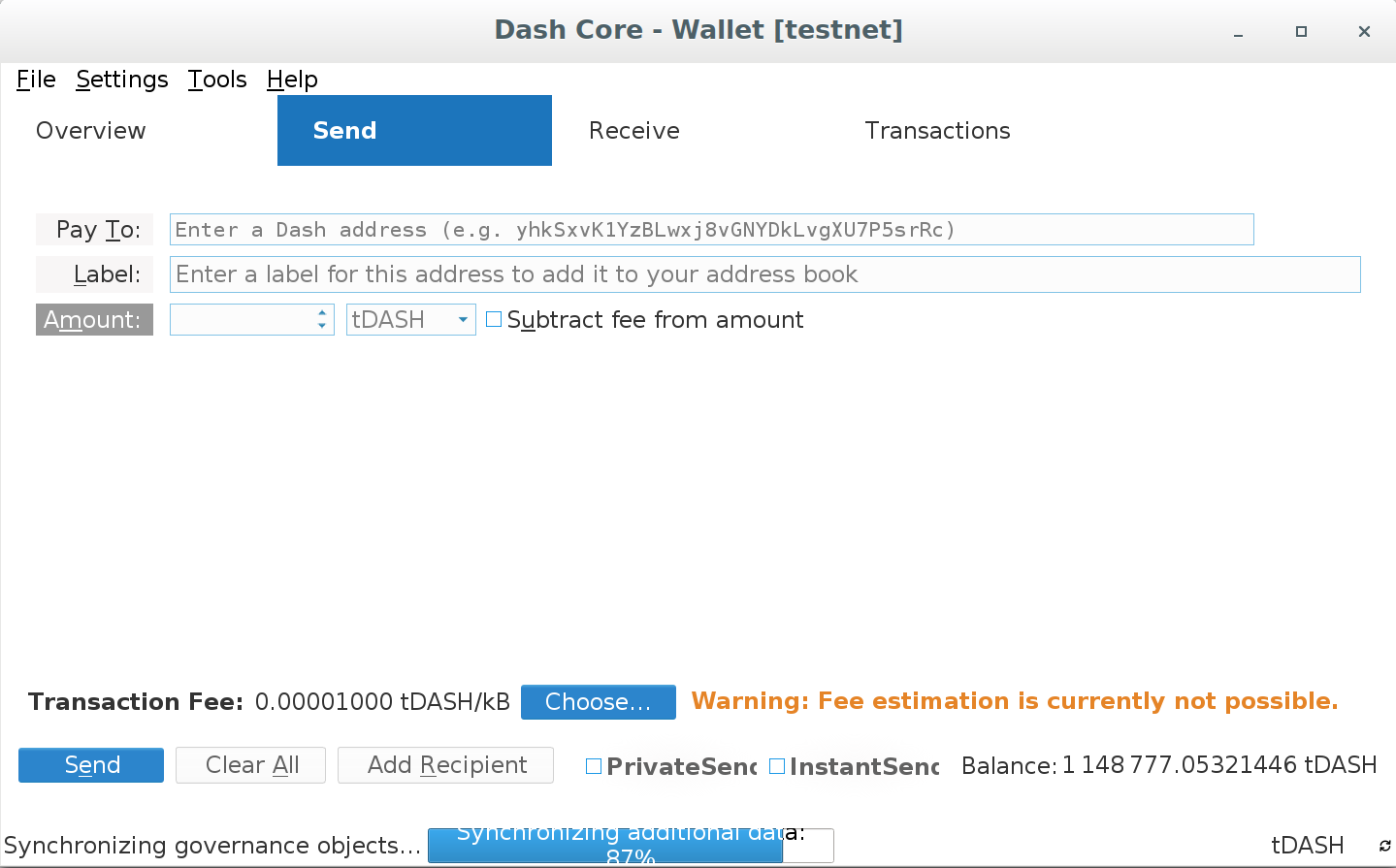
send page
receive page
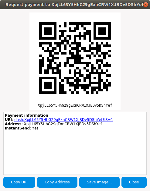
request payment

@codablock

Copy link
Copy Markdown

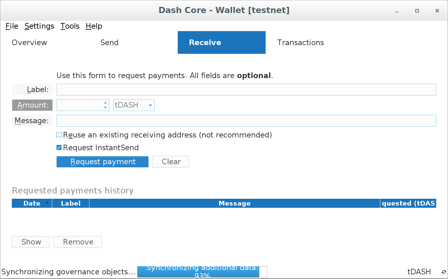
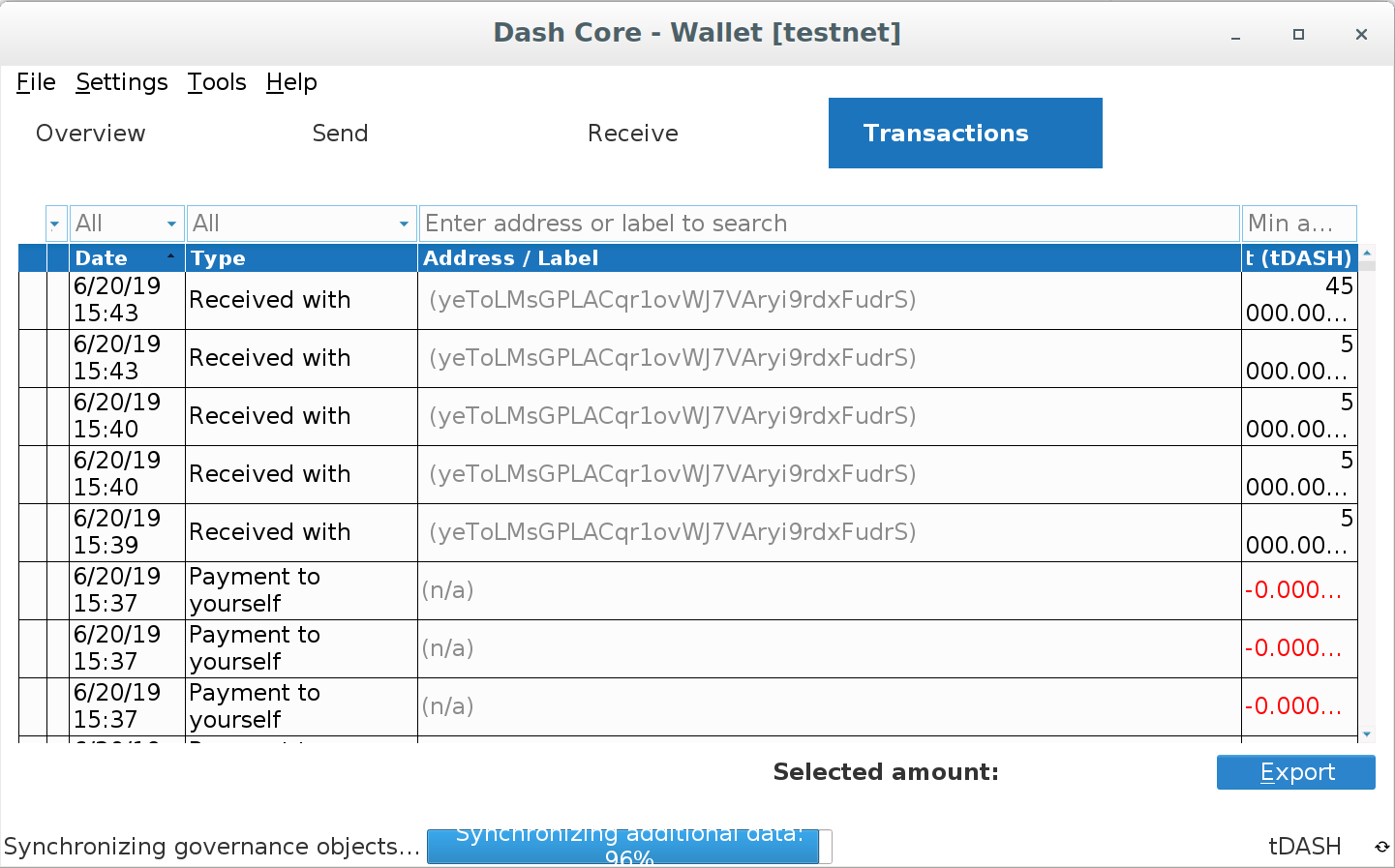
Screens from Light-HiRes theme on a HiDPI monitor.

Please note that in all screens multiple of the bottom right icons are missing:
image

Text very often overlaps or wraps strangely. Table columns are too small very often, but I assume this is not in the scope of this PR.

image
Selection_020
Selection_021
Selection_022

@nmarley

nmarley commented Oct 3, 2019

Copy link
Copy Markdown
Author

Rebased onto latest develop and force-pushed newest changes.

@nmarley nmarley mentioned this pull request Oct 8, 2019
@nmarley

nmarley commented Oct 22, 2019

Copy link
Copy Markdown
Author

I've rebased this after splitting out the extra themes removal and re-grouped into new commits (the old commit history was kind of a mess).

Should be ready for review and testing now.

@codablock

Copy link
Copy Markdown
  • 8ed6afc I can't see what's changed/updated here
  • ea3d6f5 Most icons are without transparancy now
  • src/qt/res/icons/address-book.png
    This seems to be the wrong icon (doesn't look like an address book) and also is missing transparancy
  • src/qt/res/icons/tx_inout.png, tx_input.png, tx_output.png
    I liked the older ones much better. With the new ones it's less clear what they mean. Left and right is easier associated with incoming/outgoing while up/down gives some room for more interpretations (balance gone up?).
    Also, the in+out icon has much smaller arrows then the individual ones, which is strange

@UdjinM6

UdjinM6 commented Oct 23, 2019

Copy link
Copy Markdown

Why 2df07ff ? It's not needed imo (splash image colors are adjusted automagically).

@nmarley

nmarley commented Oct 23, 2019

Copy link
Copy Markdown
Author

@UdjinM6 re: 2df07ff, I didn't know why it was removed in #3141 so assumed it should not have been.

@iamsuba Can you help answer these questions about icons that @codablock asked above?

@iamsuba

iamsuba commented Oct 23, 2019

Copy link
Copy Markdown

@codablock @nmarley

Most icons are without transparancy now
Yes, they are. There was a reason I went with non-transparent icons. I don't remember exactly why. I will try doing transparent icons and see the issues.

src/qt/res/icons/address-book.png
This seems to be the wrong icon (doesn't look like an address book) and also is missing transparancy
I will update to a new icon.

src/qt/res/icons/tx_inout.png, tx_input.png, tx_output.png
I liked the older ones much better. With the new ones it's less clear what they mean. Left and right is easier associated with incoming/outgoing while up/down gives some room for more interpretations (balance gone up?).
The icons where done this way to make is consistent with the dishpan and native wallet redesign icons, where we are using simple up and down arrows.

Also, the in+out icon has much smaller arrows then the individual ones, which is strange
The sizes are different because, the same icons are used in the transaction history pages. these sizes make it look good on transaction history pages but not in homepage. I guess we could resize the icons to be smaller.

@nmarley

nmarley commented Oct 29, 2019

Copy link
Copy Markdown
Author

Transparency has been fixed in icons now, directions fixed and sizes should be correct.

@UdjinM6 I reverted the testnet splash screen commit

@codablock As for your question about 8ed6afc, I believe this is where UdjinM6 ran the optimize images script, but I can't say for sure. I picked this from an old commit of his as the base for this work. But that's what it looks like since the file size is reduced for all these.

@UdjinM6

UdjinM6 commented Oct 29, 2019

Copy link
Copy Markdown

Ah, yes, we must run new images through mogrify (to fix nasty error messages) and optimize-pngs.py (to reduce image size). The later has to be fixed first though UdjinM6@d8f6ed7, we missed it in #3141 🙈 Changes for this PR would be UdjinM6@301121f and UdjinM6@5d92728 accordingly.

I'm still not happy with the new "remove" icon tbh #3000 (comment). I tried to make the icon in Console tab a bit larger UdjinM6@1e28314 and it's a bit better that way IMO but it's still weird. I would probably copy the old one into some new file and use it in Console instead. Or maybe we could use a more general delete/remove icon like a trashcan or smth that would fit in both places instead?

@nmarley

nmarley commented Oct 29, 2019

Copy link
Copy Markdown
Author

@UdjinM6 Cherry-picked your changes except for the last one, I didn't see where this remove.png was showing up on the debug console 'til now. I agree the old one looks better there, restored the old remove icon as console_remove.png.

@UdjinM6 UdjinM6 added this to the 14.1 milestone Oct 29, 2019

@UdjinM6 UdjinM6 left a comment

Copy link
Copy Markdown

Choose a reason for hiding this comment

The reason will be displayed to describe this comment to others. Learn more.

👍

Slightly tested ACK (light and trad looks good now imo, can't test light-hires, no such hardware here)

@codablock codablock left a comment

Copy link
Copy Markdown

Choose a reason for hiding this comment

The reason will be displayed to describe this comment to others. Learn more.

slightly tested ACK. light-hires is not very good, but at least it's not worse then other themes or what we had before

@UdjinM6
UdjinM6 merged commit d3ce096 into dashpay:develop Oct 31, 2019
@jhodges10

Copy link
Copy Markdown

@codablock need me to test hires? I've got 4k screens.

@nmarley
nmarley deleted the qt-gui-refresh branch November 11, 2019 13:18
Sign up for free to join this conversation on GitHub. Already have an account? Sign in to comment

Labels

None yet

Projects

None yet

Development

Successfully merging this pull request may close these issues.

6 participants