Show categories breakdown in flamegraph tooltip if implementation breakdown not present#4193
Conversation
Codecov ReportBase: 88.49% // Head: 88.31% // Decreases project coverage by
Additional details and impacted files@@ Coverage Diff @@
## main #4193 +/- ##
==========================================
- Coverage 88.49% 88.31% -0.19%
==========================================
Files 282 282
Lines 25107 25170 +63
Branches 6756 6778 +22
==========================================
+ Hits 22219 22228 +9
- Misses 2683 2729 +46
- Partials 205 213 +8
Help us with your feedback. Take ten seconds to tell us how you rate us. Have a feature suggestion? Share it here. ☔ View full report at Codecov. |
|
Here's a deploy preview link with a Firefox profile to which I manually added |
|
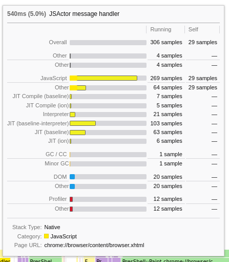
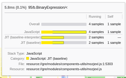
This is pretty cool! With the Firefox profile I noticed some confusing output where categories were seemingly duplicated, e.g. there are two rows for "Graphics". I think the first row is the "Graphics" category, and the second row is the "Graphics: Other" subcategory. It would be great if the Other subcategory was spelled out here. For categories for which only one subcategory is displayed, I wonder if it makes sense to leave out the category row and only display the single subcategory row. And the following could be future improvements (not handled in this PR):
|
This is due to the built in mapping of the "other" category to "", but I can change it.
|
|
I haven't looked to the code or even tried it (as I'm in holidays 😁). I just wanted to give the feedback that 1/ this is pretty cool, thanks for working on this! And 2/ what do you think of showing the categories by default, and the implementation only if there's no category data ? |
I have no real opinion on it, as in my use case there is no implementation data and introduced a flag in #4189 to essentially hide all implementation data. I think #3713 is the place to discuss these kinds of issues. |
|
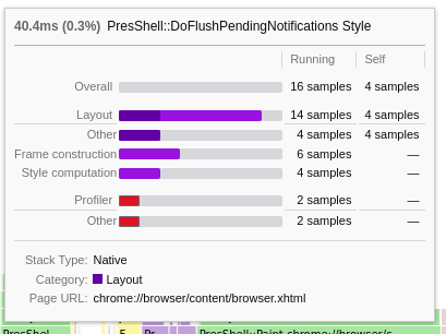
I updated it, it now looks as follows:
|
|
Now with correct colors: |
 canova
left a comment
canova
left a comment
There was a problem hiding this comment.
Thanks for working on that! Looks pretty cool!
I didn't look at the whole code yet but while I was playing with the deploy preview, I've realized that there is this extraneous bar for the leaf-most frames:
Could you take a look at this issue?
Also we need some tests for them as there is a big chunk of code that's not covered by tests right now. We can discuss it later today if you like.
|
I added tests and fixed the formatting. |
|
The vertical alignment between the blue or grey bars and the text looks like it could be improved. I think it would look better if the bottom of the colored bar was aligned with the baseline of the text. I saw this both in the screenshots here and when trying your deploy preview. |
|
You're right, thanks for spotting it. |
|
Looking at the deploy preview, I can see the following issues that will need to be resolved:
Thanks! |
|
Thanks for the suggestions, I'm currently working on them. |
aab185b to
cf6fbf2
Compare
|
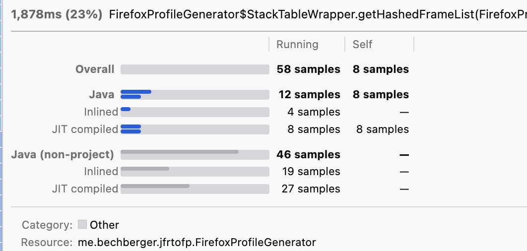
It now looks like:
With automatic brightening of colors, surrounding problematic lighter color bars with a grey line. |
|
Mmm from the screenshot it looks like the bars are a bigger height for the category than for the subcategory, also it doesn't seem to end at the same position either. |
That's fixed in the most recent commit.
That's on purpose: making the category labels bold, increases the height of the label font. This solves the centering issue |
|
I improved the style of categories: |
bc9a625 to
021c0b6
Compare
 julienw
left a comment
julienw
left a comment
There was a problem hiding this comment.
I haven't looked too closely at the code but still left a few comments, and wanted to push them to you.
About the styling, it's definitely much better than before. I'm not a big fan of the underlines though.
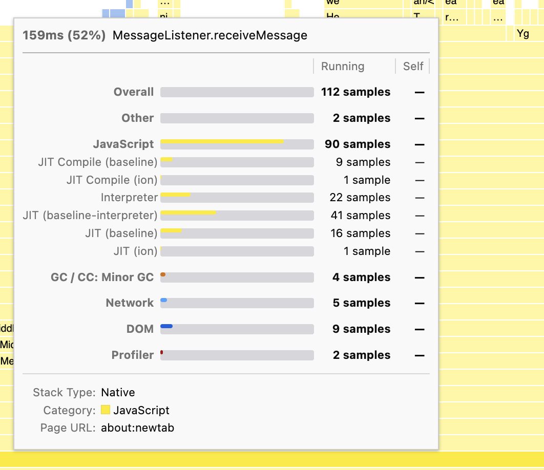
Here are some examples from a profile where I forced displaying it:
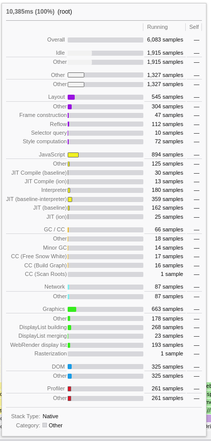
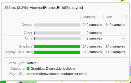
(this is with the profile with the key def4zbt1tyg8w0x7nkdtq8g7s6h3ad0ndz7jbzg if you want to try locally)
I think we can make the following improvements:
- when the only subcategory is the Other subcategory, skip it
- when there's only one subcategory, merge the category with its subcategory
- when there are several subcategories with the other subcategory, it should come last
- The bar style for the "Other" category isn't very good
- The bar style for the "self" of JavaScript category isn't very good
- The underline isn't really good when there are a few subcategories only -- but maybe this will be better once you apply the 2 first items here
Colors are hard and we may want to change how we draw self vs running time.
One quick thought, maybe it's bad but you'll tell me: instead of having one bar, with 2 delimitations inside, we could have 2 bars with half height.
This means, instead of:
JavaScript [-------|-------]##########
(last part is the grey part)
We would have:
JavaScript   [--------------]##########
             [-------]#################
(with each line being half the height than before)
Or:
JavaScript   [--------------]##########
             [-------]#######
(where the grey part for the selftime is the length of the running time)
Or:
JavaScript [-------]#######
(the grey part is for the running time, not the root time -- we still have the overall bar at the top to give the scale)
Easiest to try could be the last option, so it's worth trying.
The good thing with all these options: you don't need to bother with light versions of each colors, which should simplify the code.
Last possibility, but IMO more difficult with all the colors and the fact we already have some categories that look like this:
JavaScript [-------] ]###########
That is that the running time always has a white background, with its color only for the border.
So here are my thoughts.
Tell me what you think...
|
I think I'll give it a go myself this week, so that we can maybe reach a consensus next week. |
|
Sorry, I focused on the other PRs (like sorting and resizing), but I'll comeback to this PR tomorrow. |
no worries, my comment came after a discussion with @canova: because we're not sure of the right path, it's probably a good idea that I make my hand dirty and try the things myself :-) |
|
So I should not work on this tomorrow? |
I replaced it my making the category headers bold.
That is reasonable.
I merged it as "{category}: {subcategory}"
Ok.
That sounds quite reasonable and color agnostic:
I integrated all the other requested changes too. |
|
This looks reasonable (and usable) to me now. |
julienw
left a comment
There was a problem hiding this comment.
This is much better than the previous style, thanks for trying my solution!
Here are a few more comments. Here is the gist of them:
- we can simplify the CSS more
- we can make the algorithm easier to follow. It would be OK if you prefer to not do it, tell me what you think here.
- there's a bug with the other subcategory (that's easy to fix)
Tell me what you think
|
I integrated all your suggestions, the code is now far better readable and less complex. |
julienw
left a comment
There was a problem hiding this comment.
Thanks, this is indeed a lot simpler.
However I found an important bug, I think it's related to the key in the loop, more details below.
I'd like to see the Other category at the end of all categories, I mentioned this in my previous review too, but possibly not very clearly, sorry about that.
I think there's an issue for the selftime value of the other subcategory.
Please add just one another commit with the changes so that it's easy to review again.
| } | ||
|
|
||
| .tooltipCallNodeImplementationName { | ||
| .tooltipCallNodeHeaderRight { |
There was a problem hiding this comment.
you closed the discussion but it still doesn't seem to be used :) can you remove this block then?
|
Sorry, I missed you pushed new commits, I'll try to look at this tomorrow. |
151091e to
4213f87
Compare
|
Thanks for the fixes, they look good. |
julienw
left a comment
There was a problem hiding this comment.
I squashed all your commits first, so that I could rebase more easily. I fixed one small issue with the old-style implementation timings, fixed a warning in react (they want that we pass backgroundColor not "background-color"), and finally changed a few things only regarding the code style.
Waiting for the tests and then I can merge finally! Thanks for your patience.
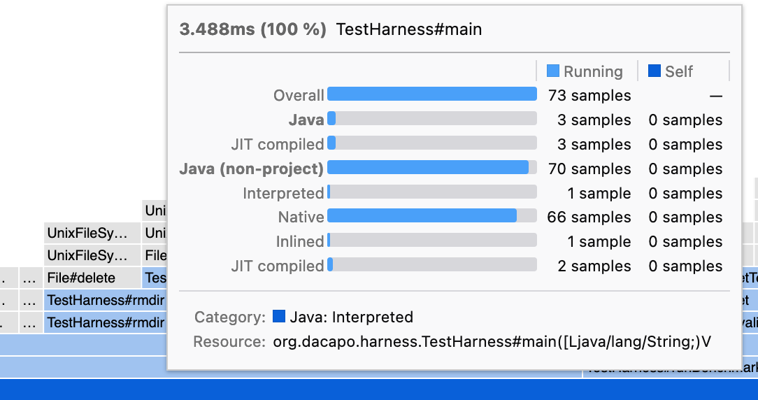
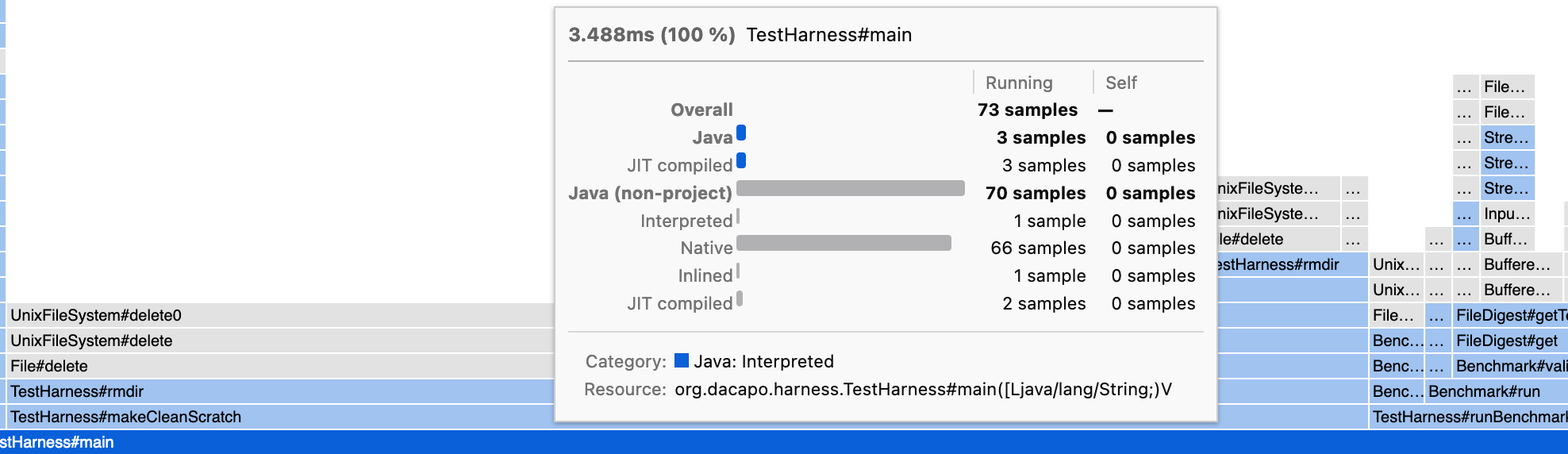
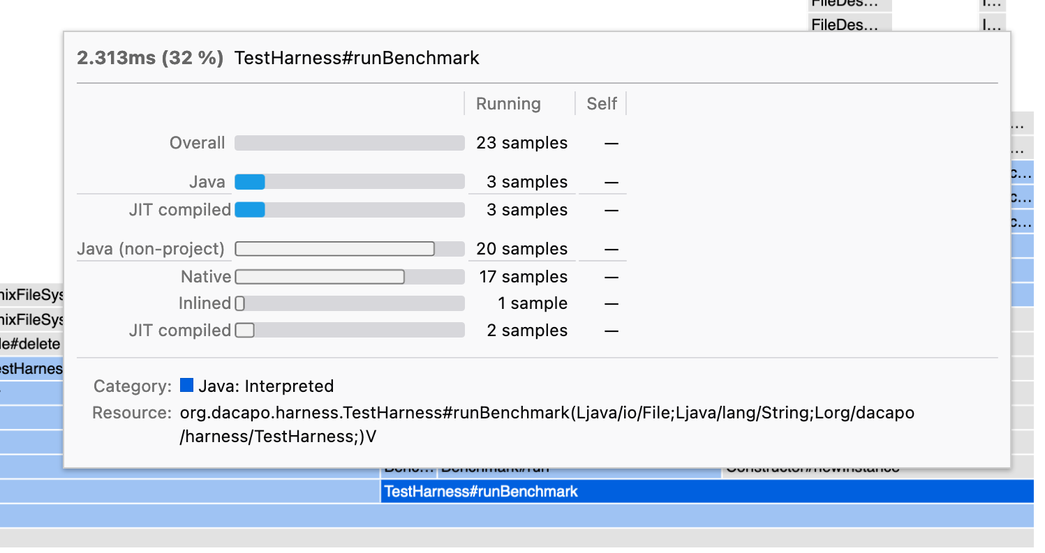
Adds a breakdown based on categories to the tooltips if the implementation breakdown cannot be shown (no implementation data present). Showing both at the same time would clutter the UI too much. Useful especially for imported profiles where the implementation data is missing.
Related to #4189 which added an option to omit the implementation data.
Sample profile
Current production
Deploy preview
Deploy preview 2