feat: add isIntersectingModifier to usePopper in v0#21829
Conversation


 msft-fluent-ui-bot
added
the
Fluent UI react-northstar (v0)
msft-fluent-ui-bot
added
the
Fluent UI react-northstar (v0)

|
This pull request is automatically built and testable in CodeSandbox. To see build info of the built libraries, click here or the icon next to each commit SHA. Latest deployment of this branch, based on commit 3bbff27:
|

Asset size changes
Baseline commit: f3017f1596086ed5af22318122baebd2ca620c41 (build) |


📊 Bundle size report🤖 This report was generated against f3017f1596086ed5af22318122baebd2ca620c41 |
Perf Analysis (
|
| Scenario | Render type | Master Ticks | PR Ticks | Iterations | Status |
|---|---|---|---|---|---|
| Avatar | mount | 702 | 747 | 5000 | |
| BaseButton | mount | 778 | 723 | 5000 | |
| Breadcrumb | mount | 2153 | 2052 | 1000 | |
| ButtonNext | mount | 424 | 381 | 5000 | |
| Checkbox | mount | 1321 | 1243 | 5000 | |
| CheckboxBase | mount | 1046 | 1131 | 5000 | |
| ChoiceGroup | mount | 3815 | 3749 | 5000 | |
| ComboBox | mount | 884 | 824 | 1000 | |
| CommandBar | mount | 8488 | 8639 | 1000 | |
| ContextualMenu | mount | 6970 | 6838 | 1000 | |
| DefaultButton | mount | 964 | 921 | 5000 | |
| DetailsRow | mount | 2920 | 3254 | 5000 | |
| DetailsRowFast | mount | 3201 | 3111 | 5000 | |
| DetailsRowNoStyles | mount | 3025 | 3116 | 5000 | |
| Dialog | mount | 1882 | 1890 | 1000 | |
| DocumentCardTitle | mount | 154 | 138 | 1000 | |
| Dropdown | mount | 3524 | 2743 | 5000 | |
| FluentProviderNext | mount | 1658 | 1629 | 5000 | |
| FluentProviderWithTheme | mount | 151 | 146 | 10 | |
| FluentProviderWithTheme | virtual-rerender | 96 | 95 | 10 | |
| FluentProviderWithTheme | virtual-rerender-with-unmount | 167 | 185 | 10 | |
| FocusTrapZone | mount | 1470 | 1456 | 5000 | |
| FocusZone | mount | 1526 | 1546 | 5000 | |
| IconButton | mount | 1473 | 1385 | 5000 | |
| Label | mount | 323 | 333 | 5000 | |
| Layer | mount | 2523 | 2350 | 5000 | |
| Link | mount | 386 | 420 | 5000 | |
| MakeStyles | mount | 1309 | 1421 | 50000 | |
| MenuButton | mount | 1278 | 1254 | 5000 | |
| MessageBar | mount | 1700 | 1616 | 5000 | |
| Nav | mount | 2627 | 2589 | 1000 | |
| OverflowSet | mount | 950 | 995 | 5000 | |
| Panel | mount | 1849 | 1775 | 1000 | |
| Persona | mount | 711 | 687 | 1000 | |
| Pivot | mount | 1164 | 1274 | 1000 | |
| PrimaryButton | mount | 1130 | 1134 | 5000 | |
| Rating | mount | 6051 | 6204 | 5000 | |
| SearchBox | mount | 1071 | 1183 | 5000 | |
| Shimmer | mount | 2182 | 2165 | 5000 | |
| Slider | mount | 1696 | 1586 | 5000 | |
| SpinButton | mount | 3973 | 4360 | 5000 | |
| Spinner | mount | 398 | 390 | 5000 | |
| SplitButton | mount | 2501 | 2731 | 5000 | |
| Stack | mount | 473 | 429 | 5000 | |
| StackWithIntrinsicChildren | mount | 1856 | 1834 | 5000 | |
| StackWithTextChildren | mount | 4372 | 4285 | 5000 | |
| SwatchColorPicker | mount | 9196 | 9350 | 5000 | |
| TagPicker | mount | 2027 | 2221 | 5000 | |
| TeachingBubble | mount | 12917 | 19360 | 5000 | |
| Text | mount | 351 | 350 | 5000 | |
| TextField | mount | 1232 | 1156 | 5000 | |
| ThemeProvider | mount | 1040 | 971 | 5000 | |
| ThemeProvider | virtual-rerender | 1582 | 559 | 5000 | |
| ThemeProvider | virtual-rerender-with-unmount | 1454 | 3876 | 5000 | |
| Toggle | mount | 692 | 673 | 5000 | |
| buttonNative | mount | 123 | 137 | 5000 |
Perf Analysis (@fluentui/react-northstar)
Perf tests with no regressions
| Scenario | Current PR Ticks | Baseline Ticks | Ratio |
|---|---|---|---|
| AttachmentMinimalPerf.default | 143 | 116 | 1.23:1 |
| ChatWithPopoverPerf.default | 342 | 291 | 1.18:1 |
| FormMinimalPerf.default | 359 | 306 | 1.17:1 |
| MenuButtonMinimalPerf.default | 1565 | 1345 | 1.16:1 |
| BoxMinimalPerf.default | 293 | 254 | 1.15:1 |
| AlertMinimalPerf.default | 234 | 208 | 1.13:1 |
| HeaderMinimalPerf.default | 313 | 277 | 1.13:1 |
| LabelMinimalPerf.default | 338 | 300 | 1.13:1 |
| GridMinimalPerf.default | 289 | 257 | 1.12:1 |
| TextAreaMinimalPerf.default | 436 | 394 | 1.11:1 |
| TableManyItemsPerf.default | 1615 | 1463 | 1.1:1 |
| HeaderSlotsPerf.default | 655 | 609 | 1.08:1 |
| SkeletonMinimalPerf.default | 290 | 268 | 1.08:1 |
| DatepickerMinimalPerf.default | 4505 | 4227 | 1.07:1 |
| ListNestedPerf.default | 476 | 443 | 1.07:1 |
| EmbedMinimalPerf.default | 3419 | 3216 | 1.06:1 |
| RosterPerf.default | 1029 | 967 | 1.06:1 |
| PopupMinimalPerf.default | 520 | 492 | 1.06:1 |
| TextMinimalPerf.default | 273 | 258 | 1.06:1 |
| TreeWith60ListItems.default | 149 | 140 | 1.06:1 |
| ListCommonPerf.default | 554 | 527 | 1.05:1 |
| StatusMinimalPerf.default | 589 | 566 | 1.04:1 |
| DialogMinimalPerf.default | 624 | 608 | 1.03:1 |
| LoaderMinimalPerf.default | 597 | 580 | 1.03:1 |
| ButtonMinimalPerf.default | 153 | 150 | 1.02:1 |
| ButtonOverridesMissPerf.default | 1334 | 1309 | 1.02:1 |
| CheckboxMinimalPerf.default | 2110 | 2076 | 1.02:1 |
| AnimationMinimalPerf.default | 414 | 408 | 1.01:1 |
| AvatarMinimalPerf.default | 149 | 148 | 1.01:1 |
| DropdownManyItemsPerf.default | 519 | 512 | 1.01:1 |
| DropdownMinimalPerf.default | 2308 | 2289 | 1.01:1 |
| FlexMinimalPerf.default | 259 | 256 | 1.01:1 |
| RefMinimalPerf.default | 213 | 211 | 1.01:1 |
| SegmentMinimalPerf.default | 305 | 303 | 1.01:1 |
| ToolbarMinimalPerf.default | 785 | 781 | 1.01:1 |
| VideoMinimalPerf.default | 484 | 477 | 1.01:1 |
| InputMinimalPerf.default | 1029 | 1028 | 1:1 |
| MenuMinimalPerf.default | 720 | 724 | 0.99:1 |
| ReactionMinimalPerf.default | 282 | 285 | 0.99:1 |
| SliderMinimalPerf.default | 1355 | 1365 | 0.99:1 |
| IconMinimalPerf.default | 510 | 515 | 0.99:1 |
| CustomToolbarPrototype.default | 3340 | 3359 | 0.99:1 |
| ListMinimalPerf.default | 433 | 443 | 0.98:1 |
| LayoutMinimalPerf.default | 272 | 279 | 0.97:1 |
| ListWith60ListItems.default | 532 | 555 | 0.96:1 |
| SplitButtonMinimalPerf.default | 3299 | 3423 | 0.96:1 |
| ChatMinimalPerf.default | 576 | 607 | 0.95:1 |
| ItemLayoutMinimalPerf.default | 924 | 969 | 0.95:1 |
| ButtonSlotsPerf.default | 403 | 429 | 0.94:1 |
| ChatDuplicateMessagesPerf.default | 238 | 256 | 0.93:1 |
| PortalMinimalPerf.default | 131 | 141 | 0.93:1 |
| CardMinimalPerf.default | 428 | 465 | 0.92:1 |
| ProviderMergeThemesPerf.default | 1337 | 1446 | 0.92:1 |
| TooltipMinimalPerf.default | 797 | 868 | 0.92:1 |
| DividerMinimalPerf.default | 274 | 301 | 0.91:1 |
| RadioGroupMinimalPerf.default | 350 | 383 | 0.91:1 |
| AccordionMinimalPerf.default | 121 | 134 | 0.9:1 |
| CarouselMinimalPerf.default | 370 | 411 | 0.9:1 |
| TableMinimalPerf.default | 311 | 351 | 0.89:1 |
| TreeMinimalPerf.default | 611 | 683 | 0.89:1 |
| AttachmentSlotsPerf.default | 818 | 929 | 0.88:1 |
| ImageMinimalPerf.default | 282 | 328 | 0.86:1 |
| ProviderMinimalPerf.default | 917 | 1813 | 0.51:1 |


| }; | ||
| state.attributes.popper = { | ||
| ...state.attributes.popper, | ||
| 'data-popper-is-intersecting': isIntersecting, |
There was a problem hiding this comment.
is it going to render data-popper-is-intersecting="false" ? or does the false not render anything at all ?
There was a problem hiding this comment.

| : false; | ||
|
|
||
| const modifiers: PopperJs.Options['modifiers'] = [ | ||
| isIntersectingModifier, |
There was a problem hiding this comment.
do we want this on by default ? could it cause any issues with customers' tests ?
There was a problem hiding this comment.
IMO yes. We have hide modifier enabled, this modifier acts in the same scope so it's reasonable to enable.
could it cause any issues with customers' tests ?
May be, but as it adds only data attribute I don't see problems with it.
 ling1726
left a comment
ling1726
left a comment
ling1726
left a comment
There was a problem hiding this comment.
Nice modifier, will you migrate it to v9 ? :)

Yes 👍 Do you want to this before or after #21828? |

before would be easier for me for sure 😛 But honestly the concepts in the modifier is very similar to Floating middleware. If you port it to v9 with vr-tests I don't mind ugprading it too |
5 participants


New Behavior
This PR adds new Popper.js modifier called
isIntersectingModifiertousePopper()hook in Fluent UI N*.This modifier is based on the ask from a partner team. Currently we have already used
hidemodifier that adds following DOM attributes based on state:data-popper-reference-hidden: This attribute gets applied to the popper when the reference element is fully clipped and hidden from view, which causes the popper to appear to be attached to nothing.data-popper-escaped: This attribute gets applied when the popper escapes the reference element's boundary (and so it appears detached).The problem that there is no state when a popover intersects boundaries:
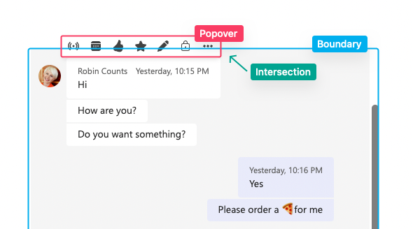
The partner team wants to hide popovers once they reach boundaries. This PR adds new modifier that adds
[data-popper-is-intersecting]once such scenario happens.The data attribute can be used to apply styling:
New visual tests were added to cover this scenario.