Appendix
Table 1: GF graph dataset statistics for 12 CS subfields. This table details each subfield's name, number of authors, topics, papers, links, and corresponding venues and coarse-grained topics.
| CS Subfield Name | #Authors | #Topic | #Papers | #Links | Representative venue | Representative coarse-grained topics |
|---|---|---|---|---|---|---|
| Natural Language Processing | 13240 | 136 | 208601 | 235217 | ACL, LREC | Text mining, Speech recognition |
| Visualization | 7081 | 84 | 85714 | 93646 | TVCG, VIS | Visualization, Visual analytics |
| Computer Security | 10732 | 132 | 232216 | 211868 | USENIX Security, CCS | Cryptography, Malware detection |
| Graphics | 5318 | 79 | 79627 | 76524 | TVCG, CGF | Computer graphics (images), Rendering |
| Computer Architecture | 20214 | 218 | 617377 | 737024 | ISCA, MICRO | Parallel computing, Distributed systems |
| Software & Programming Language | 12557 | 132 | 283600 | 396670 | PLDI, ICSE | Programming languages, Software engineering |
| Human-Computer Interaction | 5182 | 105 | 153033 | 182585 | CHI, CSCW | User interface, User experience |
| Networking | 20574 | 282 | 1049489 | 1338620 | SIGCOMM, INFOCOM | Network protocols, Distributed systems |
| Graphics & Visualization | 11980 | 105 | 271418 | 262957 | TVCG, CGF | Visualization, Computer graphics (images) |
| Database & Data Science | 12758 | 129 | 225653 | 194952 | SIGMOD, VLDB | Database management, Data mining |
| Theory & Algorithms | 24738 | 278 | 772323 | 891339 | STOC, SODA | Algorithm, Theoretical computer science |
| Artificial Intelligence at Large | 54637 | 497 | 4836561 | 8420229 | AAAI, IJCAI | Machine learning, Neural networks |
As described in Section III.A, we selected 12 representative subfields from the CS domain, as shown in Table 1. The table lists two representative venues and coarse-grained topics for each subfield (raw data, the full list of venues and coarse-grained topic can be found in GitHub). We then matched the corresponding coarse-grained topic and venues in the MAG database and extracted papers associated with these matched entities, including their authors and citation information, to construct a domain-specific database. For the defined domains, we selected top authors with an h-index above a certain threshold (default is 5, adjustable per field) and built self-citation graphs for each scholar. After constructing the graphs, we utilize the GeneticFlow graph model to conduct node and edge profiling in order to construct the GF graph, thereby identifying core papers and their citation relationships.
The pre-processed academic data is modeled by GF analytics [1] to compute a GF graph for each recipient/scholar/venue. The GF graph is designed to represent the evolution of a scholar/venue's scientific impact and contribution. Take the GF analytics of a scholar
To represent the main component of a scholar's citation-based research evolution, the concept of core GF graph is proposed, which is a subgraph
Node profiling focuses on identifying the set of core papers
Here,
where
Edge profiling involves detecting the set of core citation edges
The graph modeling process mentioned above has been evaluated in the real-world task of scientific award inference, as demonstrated in [1], where the GF model outperforms existing indicator-based and network-based profiling methods. For instance, using a GNN model for award inference in the NLP-ARC domain, the F1 score exceeded predictions based on author-level indicators by 19.8%.
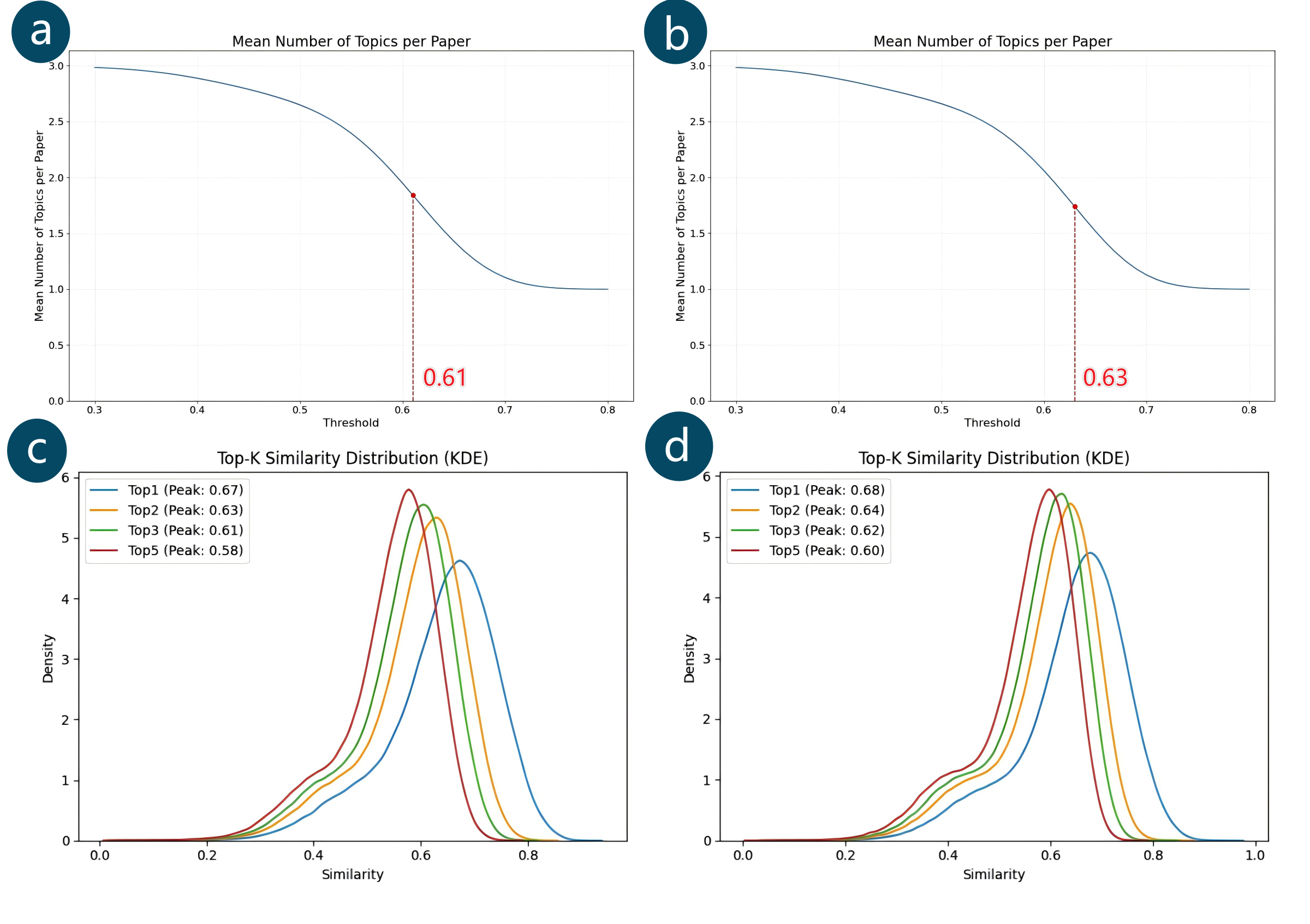
Figure 1: Sensitivity analysis of the topic-assignment threshold applied to two datasets (VCG: a, c; AI: b, d). (a-b) Mean number of topics per paper versus threshold; (c-d) Density of the N-th highest similarity score versus threshold.
We sincerely thank you for valuable suggestions to strengthen replicability. Complexity and runtime analysis are addressed in our response to Comment 4. To investigate the sensitivity of the topic-assignment mechanism, we conducted an analysis on two datasets: "Visualization and Graphics" (VCG: 271,418 papers, 105 topics) and "Artificial Intelligence at Large" (AI: 4,836,561 papers, 497 topics). The topic-assignment threshold was set within the range of
Figure 1(a-b) demonstrates how the constraint bounds the mean topics per paper between 1 and 3. The curve rises asymptotically toward 3 as
Figure 1(c-d) reveals the underlying similarity distributions, showing the N-th highest similarity peaks at progressively lower
Our selection of
The interface preserves all top-3 similarity scores, enabling users to dynamically adjust
In GeneticPrism visualization, we utilize the hierarchical layout algorithm to visualize the prism's per-topic GF sub-graph on each lateral face. However, it overlooks the interactions between the central and related topics. To address this, we propose the Integrated Flow Hierarchical Layout (IFHL) for the GeneticScroll visualization, considering not only the layout of the central graph but also integrating its influence on other topics through the flow map and streamgraph. In contrast to alternative designs of GeneticScroll, which directly draw influence edges after drawing the topic GF sub-graph, our approach integrates the layout of the central graph and influence edges together. As shown in Figure 2(a) to Figure 2(d), three steps are adopted to distinguish the central graph from the newly added influences and effectively prevent visual clutter.

Figure 2: Steps from the original GF sub-graph layout to the GeneticScroll view. (a) Original per-topic GF sub-graph; (b) GF sub-graph with influence edges; (c) GF sub-graph with influence edges using bundling; (d) GeneticScroll view: add flow map layout for influence edges and place them on the background layer, integrating with influx/efflux streamgraphs
The objective of IFHL is to lay out the context edges integrated with the original hierarchical layout. To support the need for overlapping topics, we conduct GF graph partitioning for each topic. We construct a corresponding GF sub-graph for each topic, defined as:
In this formula, (e_{ij}) is an extension edge (a reverse citation edge), (E) is the set of all extension edges in the author((s))'s collection, (v_i) and (v_j) are the source and target of edge (e_{ij}). The function (\text{topic}) maps a paper to its corresponding set of topics (with a maximum size of 3).
The set of context edges includes all edges that are connected directly to the topic in'' edges (influx), connect to the neighbor nodes upstream of the topic, while the out'' edges (efflux) connect to those downstream. To display the influx and efflux patterns, we place the in'' and out'' edges on the left and right sides, respectively. We introduce influx nodes
Here,
Table 2: Description of Nodes, Edges, and crossings.
| Type | Type ID | Type | Description | Cost |
|---|---|---|---|---|
| Node | 0 | Central node | ||
| Node | 1 | Dummy node between central nodes | ||
| Node | 2 | Proxy node, including |
||
| Node | 3 | Dummy node between influx/efflux node and central node | ||
| Edge | 0 | Edge between |
||
| Edge | 1 | Edge concerning |
weight( |
|
| Crossing | 0 | All crossing | ||
| Crossing | 1 | Weighted crossing | ||
| Crossing | 2 | Internal crossing | ||
| Crossing | 3 | External crossing |
During the layout of the GF graph, we adhere to the rules that influx/efflux nodes are always positioned on the left and right sides, arranged by year. In detail, we enhanced the Hierarchical Layout provided by GraphViz (DOT) to lay out the whole graph with influence edges and influx/efflux nodes rather than the central graph. As shown in Table 2, we considered fine-grained node types during the layout process. Due to the addition of dummy nodes in the layout process, node types include central nodes
Algorithm 1: Node Ordering with Constraint of Proxy Nodes
Input: Graph g
Output: Best order best
order = init_order(g)
best = order
for i = 0 to Max_iterations do
    wmedian(order, i) // Calculate the median positions for each layer and sort nodes based on these positions, alternating the direction of each iteration
    transpose(order) // Swap adjacent nodes to reduce edge crossings layer by layer
    for r = 1 to Max_rank do
        adjust_order(order[r], v_l(r), v_r(r))  // Adjust order[r] to place v_l(r) at the start and v_r(r) at the end, shifting other nodes accordingly
    end for
    if crossing(order) < crossing(best) then
        best = order
    end if
end for
return best
The optimization metric is changed from edge crossing to weighted crossing. The weight of edges in the middle is set to
Algorithm 2: Weighted Crossing Count Calculation
Input: Order order
Output: crossing count count
count = 0
Count = {} // Count of connections to node i in the next layer
for r = 1 to Max_rank do
    for v in order[r] do
        for e in ND_out(v) do
            for k = order(aghead(e)) to max(keys(Count)) do
            count += Count[k] × cost_weighted(e)
            end for
        Count[order(aghead(e))] += cost_weighted(e)
        end for
    end for
end for
return count
To evaluate the optimal weight
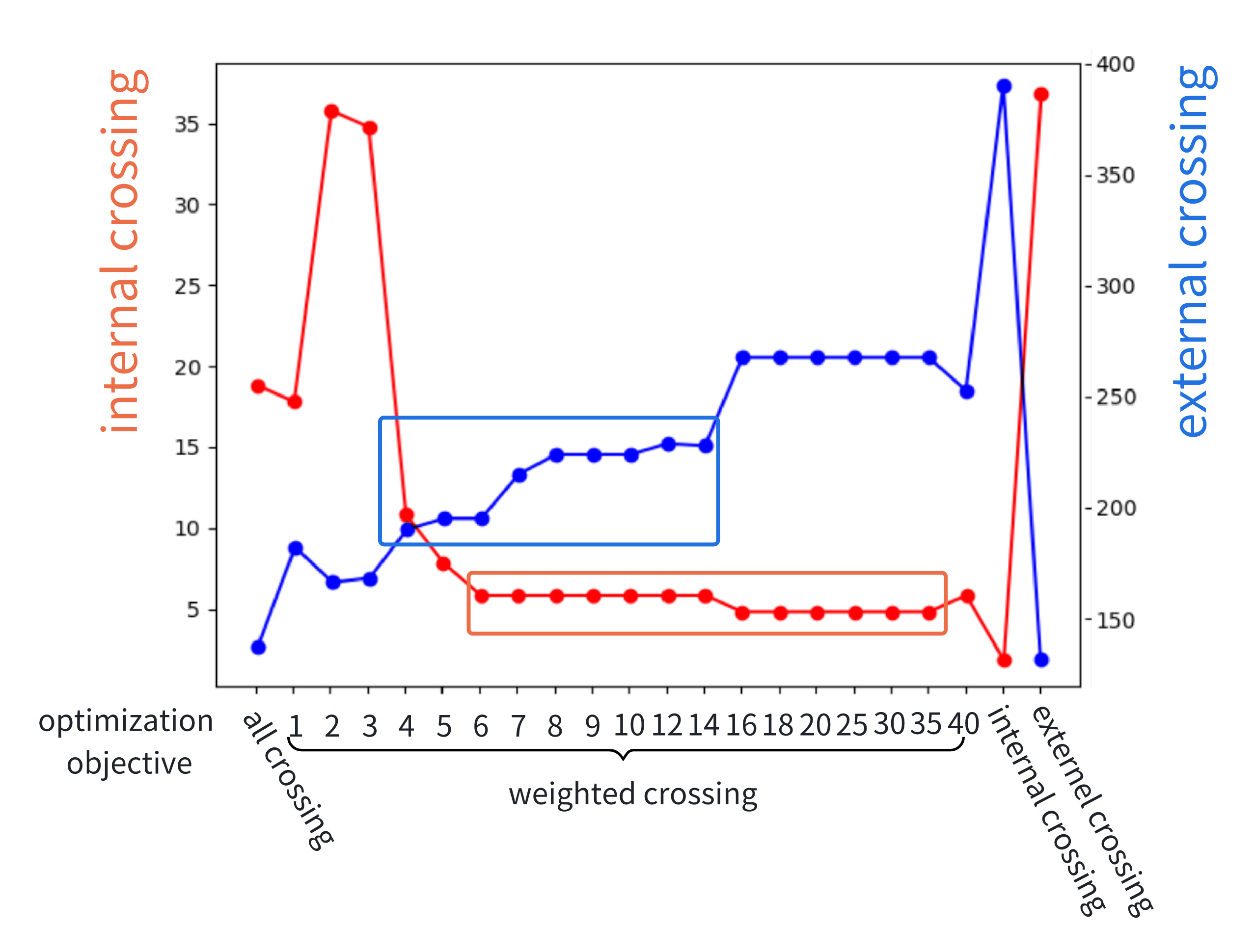
Figure 3: Internal and external crossings under different optimization objectives, in an example graph of 50 nodes, are used for determining the optimal weight (
We aimed to find an optimal objective where internal crossing was low (primary goal) while maintaining low external crossing. Using the elbow method, we determined the optimal
To generalize, we selected
Algorithm 3: Flow Map Adjustment Algorithm
Input: Edge bundles contextEdges, layout of influence edges layout
Output: Adjusted flow map layout

pointTree ← buildPointTree(layout)
order ← topologicalSort(pointTree)

for each point p in reverse(order) do
    totalWidth ← sum of widths of all paths at p
    parentEdge ← findParentEdge(pointTree)
    parentEdge.width ← totalWidth
    normal ← computeNormal(parentEdge)
    sortedPaths ← sortPaths(p)  // Sort paths at p using weighted angles: 0.5·angle1 + 0.3·angle2 + 0.2·angle3
    point ← getInitialPosition(p, normal)

    for each path in sortedPaths do
        adjustStartPoint(path, point, normal)
        point ← updatePosition()  // For next path
    end for
end for

return adjusted layout
The flow map layout ensures that the edge widths increase progressively at intersection points, akin to a Sankey diagram. The primary goal is to prevent visual clutter and edge crossings for graphs with influence edges (Figure 2(b)), resulting in a clear and comprehensible visualization of complex network flows. To achieve the Influx/Efflux flow map, we first bundle the influence edges (Figure 2(c)), calculating their intersection points. Through modeling these intersection points, we adjust the layout by tweaking the positions, thicknesses, and order of the split edges, thereby achieving the effect of a Sankey graph (Figure 2(d)).
We handle edge bundling by merging adjacent dummy nodes into a single node. However, direct merging could confuse central edges with influence edges. Therefore, central edges and influence edges are treated separately. Not bundling central edges made the pattern more evident, while context information was less critical. Therefore, we achieved edge bundling by merging only influence edges (
To adapt the flow map layout based on edge bundling results, a series of specific methodological steps are followed. The edge bundling process outputs control points defining Bézier curves. Notably, the control points at the extremities of these curves may coincide at shared locations, thereby defining branching points referred to as intersections. To render the flow map and generate a Sankey diagram utilizing these edge bundling control points, it becomes necessary to model the intersections accurately.
As shown in Algorithm 3, this is achieved by first constructing an intersection tree from the set of pre-arranged curves. Subsequently, a topological sort is performed on this tree to establish a hierarchical ordering of the intersections. This sort ensures a progressive increase in edge widths downstream from parent to child nodes, facilitating an organized flow representation. Finally, initiating the adjustment process from the downstream terminus of the topological sort, the curves are progressively refined moving upstream towards the source points.
At each intersection, the total width of all curves is calculated by summing the widths of all paths. The normal direction at the intersection is then determined using the curve of the parent intersection. Curves at each child intersection are sorted using weighted angles, calculated based on the tangent lines formed by the curve's closest three points to the intersection, with the closest point having higher weights because these Bézier curves are influenced more by the points closest to the intersection. Finally, the starting points of curves at each child intersection are adjusted based on the normal direction and the sorted order.
The flow map effectively visualizes complex network interactions by combining edge bundling and layout adjustment. Progressive edge widths and clear separation of line flows are achieved, avoiding visual clutter and crossings. This approach realizes a control-point-based Sankey diagram, providing an efficient method for visualizing intricate networks and their interactions.
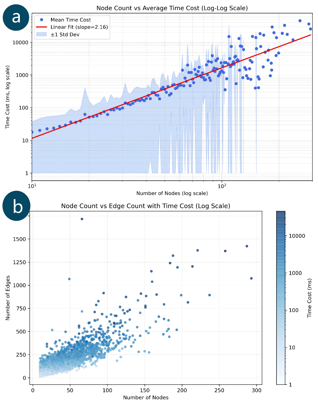
Figure 4: Scalability Analysis: Relationship between Graph Size and Runtime (log scale). (a) node count versus average time cost; (b) node count versus edge count, colored by runtime.
Our system employs a client-side computational architecture using WebAssembly to execute the core DOT layout algorithm directly within the user's web browser. This design significantly offloads server processing and enhances overall system scalability. Our server infrastructure (Django serving static resources) underwent rigorous stress testing, which confirmed its stable support for concurrent access by more than 1,000 users. Consequently, our service performance is primarily constrained by network bandwidth rather than server computation resources.
Regarding the algorithm's intrinsic complexity and scalability in the client side, our routing layout leverages the core Graphviz DOT (sugiyama-style) engine (implementation can be found at GitHub). While adhering to the theoretical complexity framework of DOT, which uses heuristics (like barycenter methods) to approximate complexity ranging from
To evaluate real-world user experience, we measured the performance of the WebAssembly-packaged ''viz.js'' module executing within the Chrome browser. Using the GF graph of the prominent AI researcher Yoshua Bengio (972 nodes, 2811 edges) as a representative large-scale scholar graph, five consecutive tests yielded an average end-to-end interactive delay of approximately 1.77 seconds, well within the acceptable threshold for perceived interactivity (
In summary, our theoretical complexity analysis, combined with empirical runtime benchmarks in both native and deployed WebAssembly environments, provides robust evidence that our layout strategy offers good efficiency and scalability for the target scales of scholor's GF graphs. Achieving responsiveness on par with established systems like VisualBib [2], the client-side architecture effectively ensures real-time interaction at the individual user level even during high concurrent access, enabling the desired interactive exploration of scholarly graphs.
This questionnaire is designed to gather your feedback on GeneticPrism, an advanced visualization system that helps explore the academic impact evolution of individual scholars. GeneticPrism is the 2.0 version of GeneticFlow, which serves as the baseline system for comparison in this study.
Your responses will help us evaluate the effectiveness and usability of these systems. By comparing GeneticPrism (v2) with GeneticFlow (v1), we aim to refine and improve the system's design and functionality. Your detailed feedback is incredibly valuable to us!
Please take your time to explore the systems and reflect on your experience. The evaluation includes 7 key questions, each including a rating for two systems (on a scale of five) followed by an open-ended question. It takes about 60 minutes to complete. For more context, refer to this user guide and case study, featuring 3 practical use cases to showcase the systems in action.
Q1. How useful did you find GeneticPrism and GeneticFlow in providing an overview of a scholar's scientific impact over time and across different topics? (shown in Figure 5)
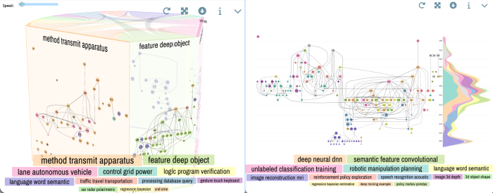
Figure 5: Temporal and topical overview of a scholar's scientific impact (Q1). On the first hand, most users will need an overall understanding of a scholar's research impact, including the research contribution across topics and over time. The design should allow a macroscopic view with a time dimension that can juxtapose and compare the scholar's impact evolution on multiple topics. e.g. Andrew Y. Ng, left: GeneticPrism, right: GeneticFlow.
Open-ended question: In your opinion, how did the 3D prism metaphor in GeneticPrism help or hinder your understanding of a scholar's scientific evolution? How did GeneticFlow compare in this aspect?
Q2. How effectively did GeneticPrism and GeneticFlow help you understand the evolution of a single research topic of a scholar over time? (shown in Figure 6)
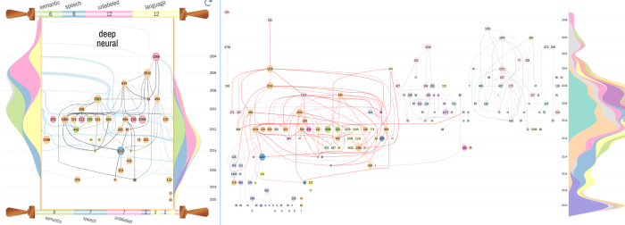
Figure 6: Detailed analysis of a scholar's impact evolution on a single research topic (Q2). For any specific topic, e.g., the one that the user is currently working on or the administrator is overseeing, s/he will need to drill down to details to complete their job. The low-level tasks include but are not limited to identifying key papers, understanding research threads/clusters, and predicting. e.g. Andrew Y. Ng (deep neural DNN topic), left: GeneticScroll of deep neural (detailed view of GeneticPrism), right: GeneticFlow with topic highlighted.
Open-ended question: How did the GeneticScroll visualization (in GeneticPrism) help clarify the evolution of a single topic? Was GeneticFlow as effective? What could be improved?
Q3. How effectively did GeneticPrism and GeneticFlow help you understand the interaction and influence patterns between multiple research topics of a scholar? (shown in Figure 7)
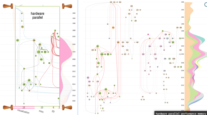
Figure 7: Discover influence and interaction patterns among multiple research topics of a scholar (Q3). For topic planning and research outlook, users will need to figure out the causal relationship among multiple research topics of a scholar. This can be achieved through the visual analysis of citation influence patterns among papers belonging to these topics. e.g. Pat Hanrahan (influence from topic hardware parallel to topic visualization), left: GeneticScroll of hardware parallel (detailed view of GeneticPrism), right: GeneticFlow with topic highlighted.
Open-ended question: How did the GeneticScroll and chord diagram in GeneticPrism help in visualizing the connections between different topics? Was GeneticFlow able to achieve a similar level of clarity?
Q4. How useful were GeneticPrism and GeneticFlow in helping you identify key interdisciplinary papers that had significant influence across topics or fields? (shown in Figure 8)
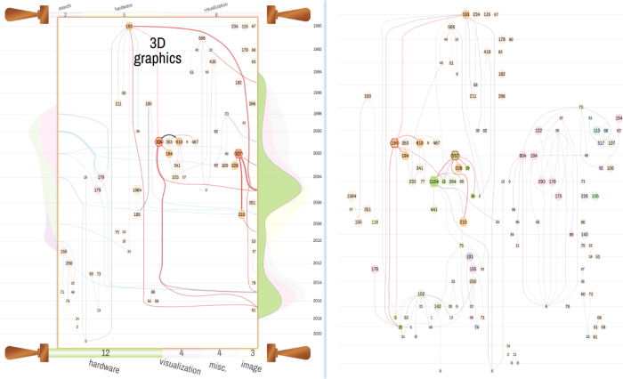
Figure 8: Identifying key interdisciplinary papers and their influence patterns (Q4). During topic transitions of a scholar, there usually is not a clear-cut pattern between old and new topics. It is crucial for our users to identify the key papers that conduct interdisciplinary research on these transitional topics. The context of this research can help explain the reasoning behind the process of scientific evolution. e.g. Pat Hanrahan (3D graphics topic), left: key interdisciplinary papers in GeneticScroll of 3D graphics (detailed view of GeneticPrism), right: same interdisciplinary papers in GeneticFlow.
Open-ended question: Did the six-degree impact metaphor in GeneticPrism help you identify interdisciplinary works more effectively? How did this compare to GeneticFlow in terms of revealing cross-disciplinary research?
Q5. How effective were the interactive features (e.g., navigating between topic facets, switching between prism and scroll, inspecting nodes and links) in GeneticPrism compared to GeneticFlow?
The 3D prism supports zoom and pan and can be rotated upon mouse drag to focus on topics more interesting to the current user. Another animation mode is also supported in that the prism will rotate around its center at a constant rate, presenting a dynamic overview for better analysis. Clicking on topic tag will drill down to the GeneticScroll visualization of the corresponding topic. For GeneticScroll, hovering an influx/efflux streamgraph layer highlights the part of the flow map representing the influx/efflux flows from/to the corresponding topic.
Open-ended question: Were there any specific interaction features in GeneticPrism that you found particularly engaging or frustrating? How does it compare to GeneticFlow?
Q6. How visually appealing and enjoyable did you find the GeneticPrism and GeneticFlow visualizations, including their layout and design?
Open-ended question: What aspects of the visual design in GeneticPrism stood out to you in comparison to GeneticFlow? Were there any parts that you found more enjoyable or easier to interpret? Were there any aspects of the visualization in GeneticPrism that made it easier or harder to understand the data?
Q7. How effectively did GeneticPrism and GeneticFlow model the research topics of each paper?
In GeneticFlow, each paper is assigned one topic, which can sometimes oversimplify the research if a paper covers multiple themes. On the other hand, GeneticPrism assigns multiple topics to each paper, selecting the top 3 topics based on cosine similarity and a relevance threshold. This allows for a more nuanced and accurate representation of a paper's research, especially when dealing with interdisciplinary or multifaceted works.
Open-ended question: Did the topic modelling method in GeneticPrism (which assigns multiple topics to a paper) more accurately reflect the research content compared to GeneticFlow (which assigns a single topic)? Did the multi-topic approach improve the representation of interdisciplinary or multi-faceted research?
[1] Y. Luo, L. Shi, M. Xu et al. Impact-oriented contextual scholar profiling using self-citation graphs. In KDD’ 23, pp. 4572–4583, 2023.
[2] A. Dattolo and M. Corbatto. Visualbib: A novel web app for supporting researchers in the creation, visualization and sharing of bibliographies. Knowledge-Based Systems, 182:104860, 2019.