Login: Social Error Screens - #7887
Conversation


|
|
||
| // MARK: UITableViewDataSource methods | ||
|
|
||
| extension LoginSocialErrorViewController |

There was a problem hiding this comment.
Opening Brace Spacing Violation: Opening braces should be preceded by a single space and on the same line as the declaration. (opening_brace)
5d15084 to
0ec7017
Compare

|
Heya @nheagy!
|

 aerych
left a comment
aerych
left a comment
aerych
left a comment
There was a problem hiding this comment.
Hiya Nate! Here are a few thoughts after peeking at the code and playing with the screen in the simulator. I had a couple of suggestions. Overall the code is very pretty. :) Nice yo!
| configureViewLoading(false) | ||
| if awaitingGoogle { | ||
| let socialErrorVC = LoginSocialErrorViewController(title: NSLocalizedString("Unable To Connect", comment: "Shown when a user logs in with Google but it subsequently fails to work as login to WordPress.com"), description: error.localizedDescription) | ||
| navigationController?.setViewControllers([socialErrorVC], animated: true) |
There was a problem hiding this comment.
Is this a good place to set awaitingGoogle back to false?
There was a problem hiding this comment.
Yes, tho I expect this VC will get dealloced because the navigation controller is about to release it.
| let socialErrorVC = LoginSocialErrorViewController(title: NSLocalizedString("Unable To Connect", comment: "Shown when a user logs in with Google but it subsequently fails to work as login to WordPress.com"), description: error.localizedDescription) | ||
| navigationController?.setViewControllers([socialErrorVC], animated: true) | ||
| } else { | ||
| configureViewLoading(false) |
There was a problem hiding this comment.
Shouldn't we still set configureViewLoading(false) regardless of the value of awaitingGoogle?
There was a problem hiding this comment.
Yeah, probably. Same thinking as above—currently this method destroys the current VC so ¯\(ツ)/¯
But I can see that a future refactoring may miss the need to make these changes, so perhaps they make sense regardless 😀
| descriptionLabel.font = WPStyleGuide.mediumWeightFont(forStyle: .subheadline) | ||
| descriptionLabel.textColor = WPStyleGuide.darkGrey() | ||
| descriptionLabel.numberOfLines = 0 | ||
| descriptionLabel.heightAnchor.constraint(greaterThanOrEqualToConstant: 14.0).isActive = true |
There was a problem hiding this comment.
Should this constant be a ... constant?
| import Foundation | ||
| import Gridicons | ||
|
|
||
| class LoginSocialErrorViewController: UITableViewController { |
There was a problem hiding this comment.
This might have been a good candidate for ImmuTable. Just FYI. No need to refactor.
There was a problem hiding this comment.
Ah, right. Hadn't even crossed my mind.
|
|
||
| let storyboard = UIStoryboard(name: "Login", bundle: nil) | ||
| if let controller = storyboard.instantiateViewController(withIdentifier: controllerKey) as? NUXAbstractViewController { | ||
| navigationController?.setViewControllers([controller], animated: true) |
There was a problem hiding this comment.
I'm not sure about this. Summoning @folletto.
When I first tapped the email option to retry another view controller appeared to be pushed onto the stack. My expectation, since the error screen was pushed onto the nav stack, was that I'd go back a screen. But then there's no back button so that's a bit odd.
When I tried the option to sign up I was trapped with no way to get back to the login flow.
This is similar for the site address screen... there is no way to return to the email screen.
Given the scenarios above I think it would make sense to present the error screen as a modal and maybe let the presenting controller decide what action to take via a delegate method. Thoughts?
There was a problem hiding this comment.
Ya, I could see model presentation + delegate as a nice UX.
I did it this way because of the navigation bar being part of these screens. I'd also like to hear @folletto's take 😀

There was a problem hiding this comment.
I guess I need to ask a screenshot of the 2+ screens you're discussing about. It's a bit too theoretical in writing :D
There was a problem hiding this comment.
@folletto here's a demonstration: http://d.pr/v/bX1dEZ
Producing that video made it clear that @aerych has a point. A bit of direction on how best to alter it please 😀
There was a problem hiding this comment.
The "← Back" action should be present there, behaving exactly like the user just opened that screen in a normal flow of actions, which means that the "Back":
- On the site address screen, it should go back to the email screen (where normally the user would select to enter site address).
- On the email screen, it should go back to the intro screen.
This is because these actions there act as "shortcuts" into a specific part of the flow.
There was a problem hiding this comment.
The "← Back" action should be present there, behaving exactly like the user just opened that screen in a normal flow of actions
I have concerns about this. In the video example Nate shared new screens are sliding in from the right and the error screen is transitioned away by sliding to the left... a typical navigation experience. This implies that tapping back will take the user to the error screen, but if I understand correctly, we're suggesting that we break this expectation. So the experience would be the error screen slides in, the user taps an option on the error screen, a new screen slides in. The user taps the back button... but rather than seeing the error screen they see something different. I expect this would be confusing.
I think it would be better for the error screen presented modally so it slides up from the bottom of the screen and dismisses by sliding down. This removes any expectation that it is something the user would see by tapping a back button.
There was a problem hiding this comment.
Yep — the sliding motion should be different too with this model.
If we want to do it modal we need to go back to the design and rework both iOS and Android at this point.
There was a problem hiding this comment.
Caught up with @folletto in chat. To summarize ... we're talking about the same thing but speaking in different terms. :D So let's go ahead and present the error screen "modally" (such an ambiguous term), full screen, sliding up from the bottom, etc. so we avoid any weirdness with user expectations and the back button. :)
| // MARK: UITableViewDelegate methods | ||
|
|
||
| extension LoginSocialErrorViewController { | ||
| override func tableView(_ tableView: UITableView, estimatedHeightForRowAt indexPath: IndexPath) -> CGFloat { |
There was a problem hiding this comment.
I think this method isn't needed when setting tableView.estimatedRowHeight
|
|
||
| tableView.estimatedRowHeight = 100.0 | ||
|
|
||
| view.backgroundColor = WPStyleGuide.greyLighten30() |
There was a problem hiding this comment.
Seems like these properties would be better set on viewDidLoad since its work that should only need to be done once.
| } | ||
|
|
||
| override func tableView(_ tableView: UITableView, heightForFooterInSection section: Int) -> CGFloat { | ||
| return 0.5 |
There was a problem hiding this comment.
I think this method can be removed if tableView:viewForFooterInSection: returns UIView(frame: .zero). Seems that way when I test. Same for setting the footer.backgroundColor
There was a problem hiding this comment.
This draws the dark line above and below the button cells.
The initial frame size of .zero will be ignored/modified by autolayout.
There was a problem hiding this comment.
I totally missed that there were lines in the mock. Totally makes sense now. :)
The initial frame size of .zero will be ignored/modified by autolayout
This hasn't been my experience, but whatev 🤷♂️
There was a problem hiding this comment.
I usually just do UIView() not sure why I decided to use UIView(frame: .zero) here 😜 I'll probably switch it to the former, to make the result more clear.
|
Something I've been thinking about is how to best share some of our existing screens, like 2fa and the wpcom password screen, while performing a google login flow. |
|
I agree that we need a way to maintain state between all the login screens. And I agree that |
|
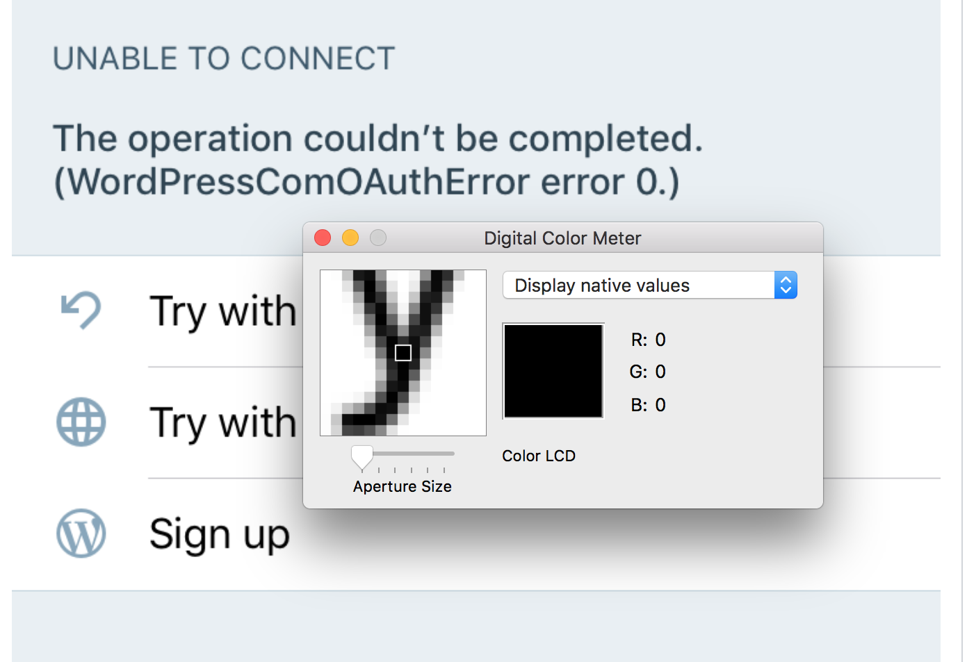
Good call on the button text color. The mockup is darker than the handbook's |
Did you mean the cell text color? Not sure we're talking about the same thing? Fwiw, Digital Color Meter shows it as #000000, even in the screen shot above.: |
|
@aerych I know the PR has the text as black. I’m referring to the color used in the mockups - it is darker than our darkGrey. |
|
Ahh. Gotcha! 👍 |

|
Ah thanks for that review of text color. As a general rule of thumb:
|
 after resolving the conflicts :)
| let imageView = UIImageView(image: image.imageWithTintColor(UIColor.white)) | ||
| navigationItem.titleView = imageView | ||
| } | ||
| func addHelpButtonToNavController() -> (UIButton, WPNUXHelpBadgeLabel) { |
| import Gridicons | ||
|
|
||
| class LoginViewController: NUXAbstractViewController { | ||
| protocol LoginWithLogoAndHelpViewController { |

5 participants


Refs #7675
Error display screen for when login to Google succeeds, but login using the token with WordPress.com subsequently fails.
To test:
Note:
This is forked from #7872 and can't be merged until that PR is approved & merged.
Needs review: @aerych