MCKIN-12287 Feedback icons changed to buttons for MCQs and Multi rating questions - #256
Conversation


 Agrendalath
left a comment
Agrendalath
left a comment
Agrendalath
left a comment
There was a problem hiding this comment.
@musmanmalik, sorry for the delay. My devstack stopped working and provisioning new one from the current Ironwood branches seems to be broken, so I had to find a workaround.
I tested this and it seems to have 3 problems:
- In rating question, when I click on the text (
span.choice-label-text) of thechoice, thebutton.choice-resultgets focused. Instead of this, theradio inputshould be selected (and get focus effectively, of course). This indicates what happens when I click the text of the first choice:
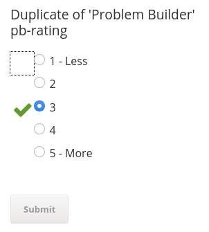
- Accessibility issue - when users "tab" through the block, they get focus on each hidden
button.choice_result. This is a very confusing behavior. Shouldn't only the visible result be focusable instead? - After pressing
Submitthebutton.choice_resultis not getting focus. Shouldn't this be a case to show users feedback immediately after they submit their answer?
cc: @giovannicimolin, point 2. and 3. seem to be related to #257, right?

|
@Agrendalath Please review it again we have fixed identified issue. Thank you |
Agrendalath
left a comment
Agrendalath
left a comment
There was a problem hiding this comment.
@musmanmalik, there are still a few issues here.
- (This is a similar problem to the previous one, but the focused object has changed now.) In rating question, when I click on the text (
span.choice-label-text) of thechoice, themain#maingets focused. Instead of this, theradio inputshould be selected (and get the focus effectively, of course).
A tip for debugging this: I'm using a Focus Indicator Chrome extension for checking the focus. - The placement of
.choice_tipsis broken now for both blocks. Please see:
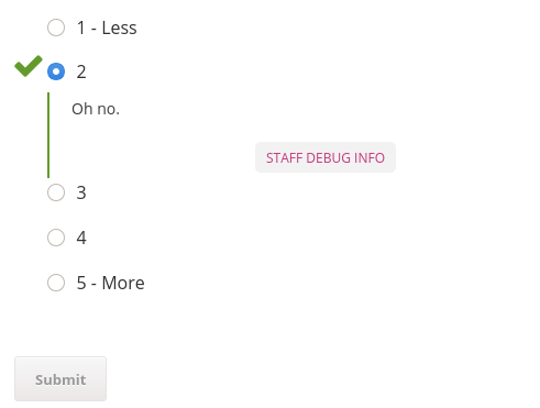
- (I'm copy-pasting this one here, as it hasn't been addressed on the ticket. Is the follow-up planned to address it?) After pressing
Submitneitherbutton.choice_resultnor.choice_tipsare getting focus. Shouldn't this be a case to show users feedback immediately after they submit their answer?
|
@Agrendalath I have pushed the resolution for 1,2. As for 3 is concerned it is not in the scope of this ticket. We have some follow up tickets which will deal the navigation order and your identified concern since its also not a ripple of this pr. |

|
@musmanmalik, I confirm that the first and the second issue has been resolved. After: |
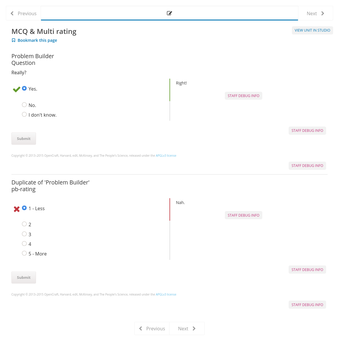
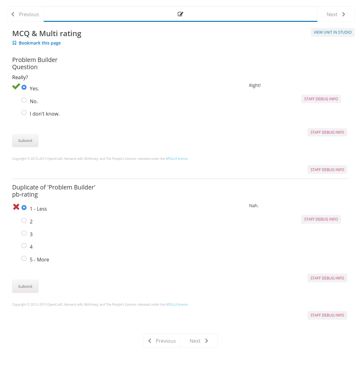

|
@Agrendalath Please have a look now |
Agrendalath
left a comment
Agrendalath
left a comment
There was a problem hiding this comment.
Thank you for fixing these issues, @musmanmalik!
👍
- I tested this: checked that it's working on both devstacks; the padding is a little different now, but it actually looks much better on mobile devices (was broken before); checked that feedback icons are now focusable
- I read through the code
- I checked for accessibility issues
-
Includes documentation


4 participants


We are working on accessibility. This is also one the the reported. This fix has been done for MRQs case previously. Now This fix is for MCQs and multi rating questions.
At a basic level, all custom controls within a web application should provide identifying information about the component. This includes a name, type (role) and may contain state, value, and description information. When custom elements do not expose identifying information, users of assistive technology may not be able to identify and interact with the element. For example, without knowing the role or state of an element, the user of a screen reader may not know what actions can be performed on an element even if the element exposes a textual name. Without a proper role, assistive technology interactions that rely on roles being identified may not become available to the user.
The best approach is to use the element and appropriate aria attributes to indicate all the required information. This will make the icons keyboard focusable by default.
@xitij2000 @Agrendalath Please review this pull request. Thanks.